





ABOUT

Designer and builder working across financial products, design systems, and AI workflows. Currently Head of UX at PIMCO.

EXPERIENCE

PIMCO AIG BlackRock American Express Citizens

PIMCO Digital Brand

ROLE
Head of User Experience
SCOPE
Digital Brand
Product Design
Design System
INDUSTRY
Investment Management
Financial Services
TYPE
Website
Email
Professional walking up a sunlit staircase
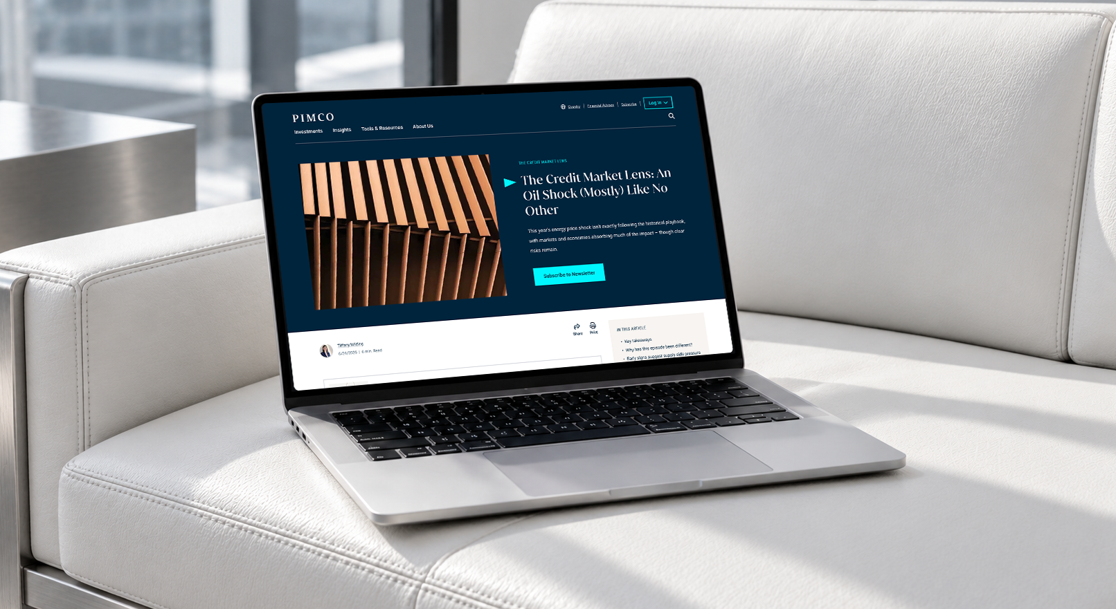
Laptop on a white sofa
A woman in conversation in a bright office
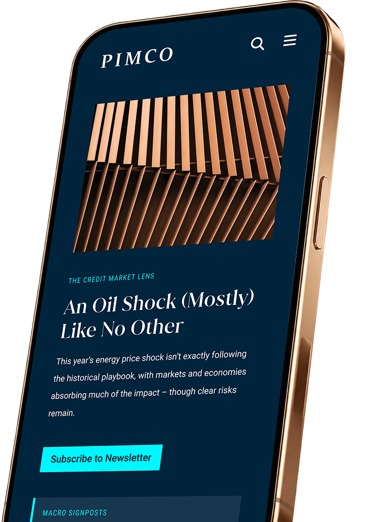
PIMCO mobile article about the credit market and oil shock
/01

Rooted in the Pacific

As a leader in fixed income, PIMCO needed a digital presence as distinctive as its perspective. I brought its Pacific roots into the interface through oceanic colors and open space. The pinnacle imagery reflects a firmwide commitment to rigor and clarity. I also led an in-house platform migration around Sitecore and a shared Angular component library, cutting operating costs by 50%.

YEARLY OPERATING COST
Reduced from 1M to 500K
CMS
Sitecore
COMPONENT LIBRARY
Angular
DESIGN DECISION
Distinctive, inspired by the Pacific
/02

Complex Choices, Made Clear

Client feedback showed that finding the right funds added unnecessary friction. I redesigned browsing around discovery and comparison, with detailed fund information one step away. Bringing fund documents into the header made an important part of that research easier to find. Monthly US downloads rose from 11,500 to 12,400 in GA4, giving us a stronger signal of investment consideration.

DOCUMENT DOWNLOADS
11,500 → 12,400
(Average monthly rolling, US)
MEASUREMENT
GA4
USER SIGNAL
Document download is the highest investment intent activity
DESIGN DECISION
Key downloads visible in the page header
/03

Market Insights to Action

Clients rely on PIMCO for its market perspective, but they wanted those insights to be easier to understand, share, and act on. Partnering with Content Marketing, we rebuilt article pages to highlight key takeaways and supplement them with related charts, podcasts, and articles. Scroll depth rose 20%, and 60% of users interacted with related content.

SCROLL DEPTH
+20%
CONTINUED EXPLORATION
6 of 10 clicked related content
(Up from 4)
MEASUREMENT
GA4
DESIGN DECISION
Supplement long form content with bite sized insights
/01

Written Brief to Working Email

Building an email meant writing a brief in Word, handing it to an outside vendor, and working through rounds of revisions. I built Email Studio so channel marketers could create and review emails directly. Shared components give them control over content while keeping the design consistent. Average design-to-delivery speed increased 40%.

DESIGN TO DELIVERY
5 days → 2 days
SUPPORTED CHANNELS
Advisor Forum, In Person Events, Webcasts, Product Launches, Thought Leadership, and Subscriptions.
WORKFLOW
Drag and drop editor
BUILT WITH
GitHub Copilot CLI, Angular
/02

Components at Scale

New components still needed to ship on time, even with a smaller build team. I built an inspection view that puts the actual code, spacing, typography, colors, and assets in one place. Designers and developers can check the same details as the system grows. The team maintained its previous component delivery timeline despite reduced headcount.

DELIVERY
One new component per week
TEAM CAPACITY
Reduced from 4 to 1
(Components ship at previous pace)
INSPECTION
Bundled code, design variables, and assets
DESIGN DECISION
Provide shared design reference for implementation
/03

Type to Build

What if making an email started with saying what you need? I built a conversational prototype around the drag and drop editor. A brief becomes a live email, then follow-up requests add event details, funds, and legal copy. The component system holds the design rules while the marketer reviews and refines the result.

STATUS
Beta release
OPPORTUNITY
Draft emails, websites, and social through conversations
RISK
Token cost associated with creation and refinement
TESTING
Determine user preference and effectiveness
Scrub Capital

ROLE
Designer
SCOPE
Brand Identity
Motion Design
INDUSTRY
Healthcare
Venture Capital
TYPE
Brand Platform
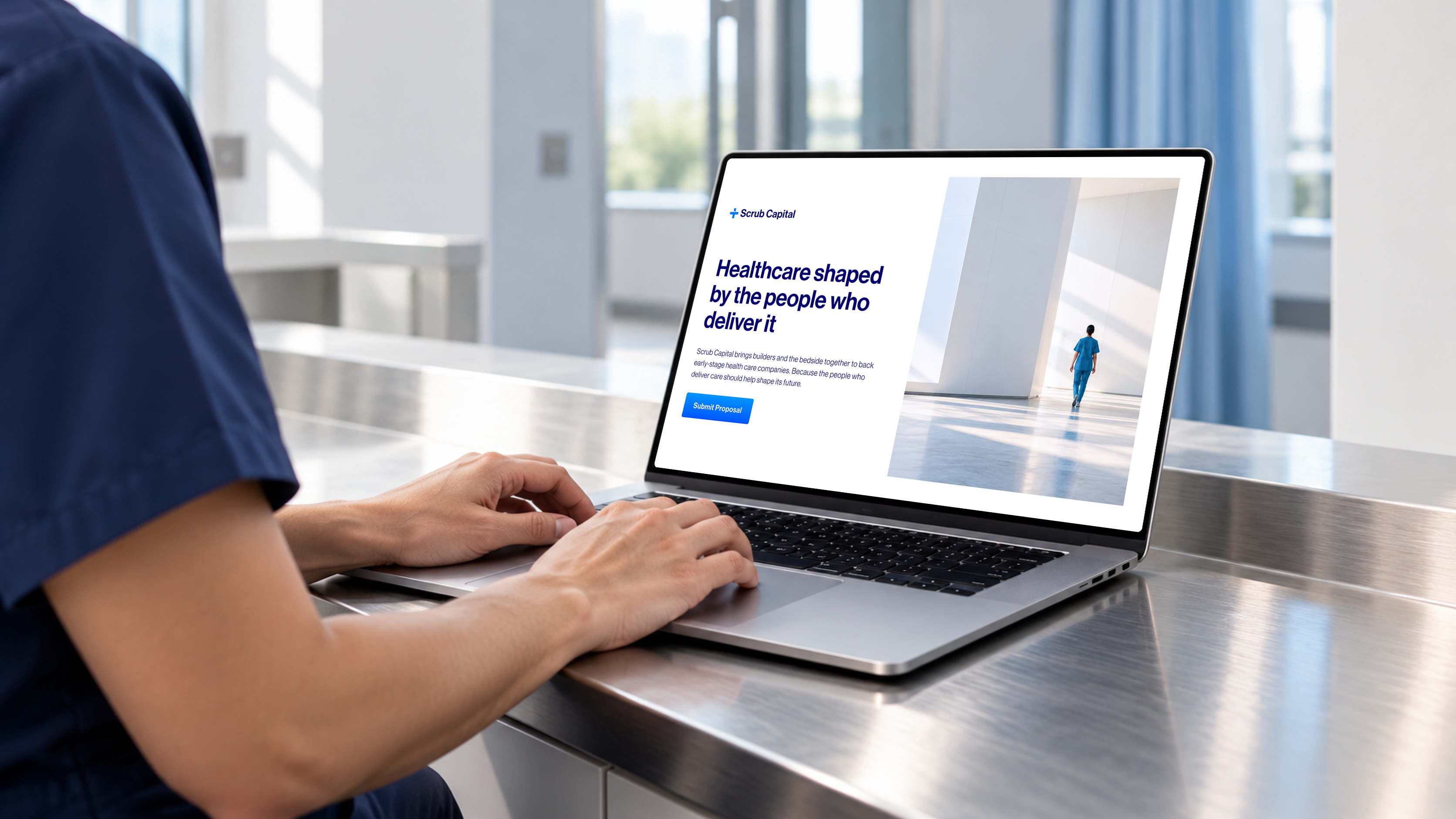
Scrub Capital healthcare investment website shown on a laptop
Clinician in blue scrubs Physician and healthcare founder Physician in a white coat
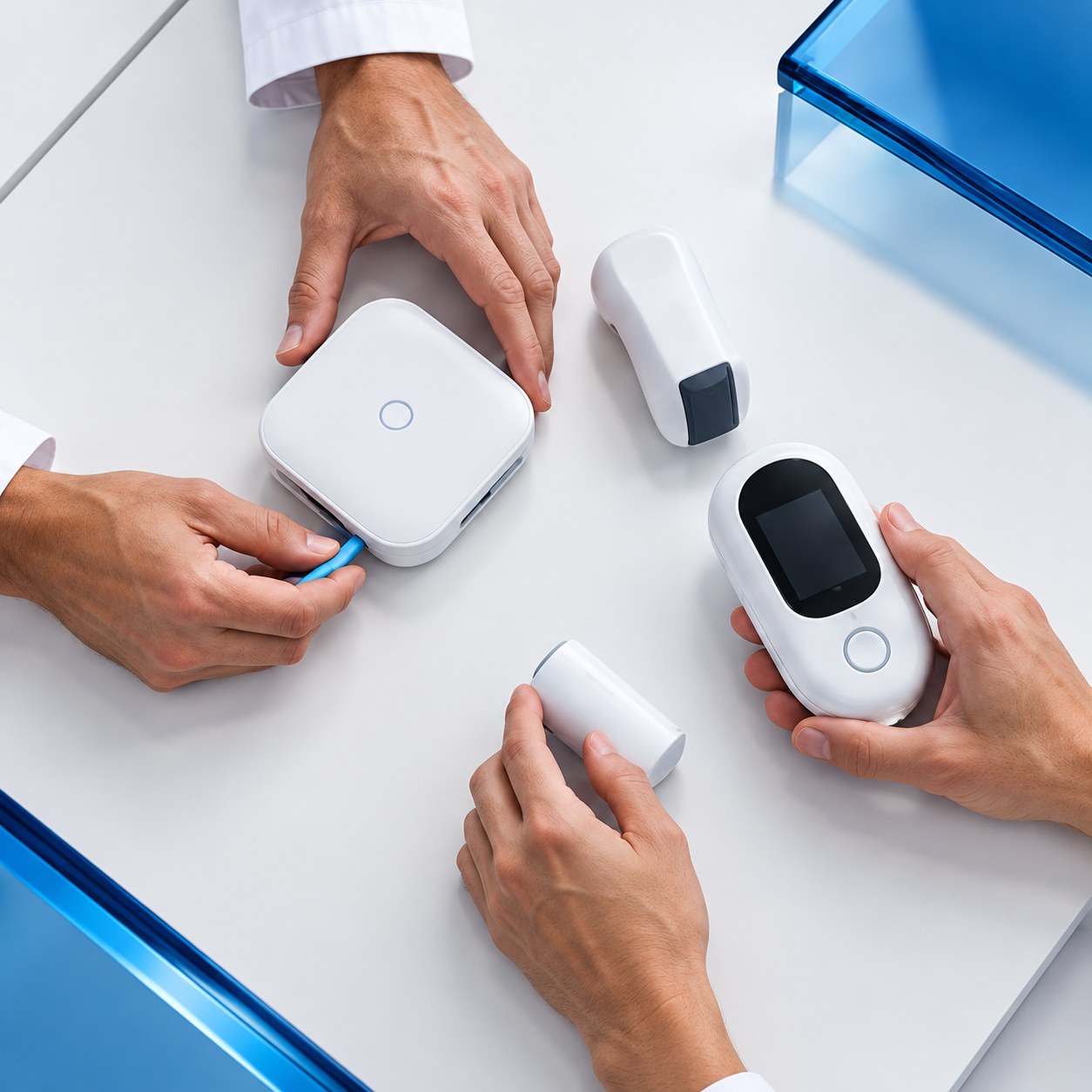
Clinicians working together with connected medical devices
Scrub Capital mark
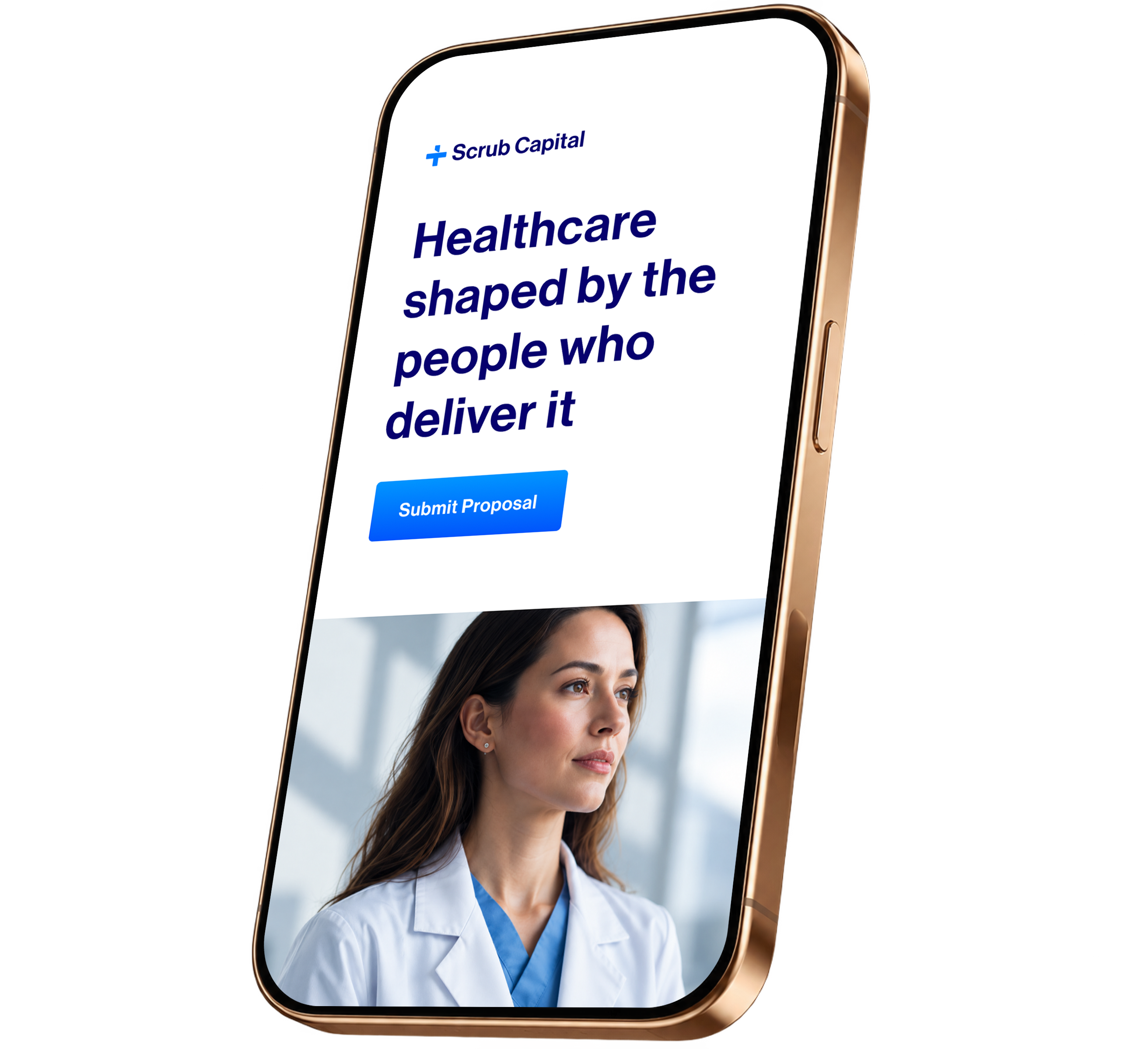
Scrub Capital healthcare brand on a mobile phone
/01

By Clinicians, for Clinicians

Scrub backs healthcare founders with firsthand experience delivering care. I centered the identity on that connection between clinical experience and company ownership. The logo brings together ideas of the cap table and health, while motion adds energy and keeps the founders and their message at the center.